Making an interactive Graph
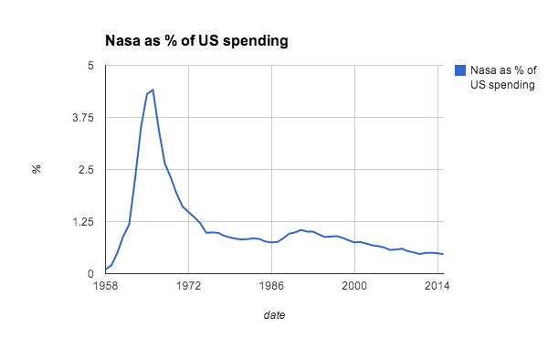
I wrote a comment piece for our science news blog, Catalyst Science News, with the headline Why we should privatise space. I will link to it when it is published, as it is still to be edited. Part of my argument was that the traditional nation state superpowers were showing a declining interest in space exploration, but I felt I needed some sort of data to illustrate this.
I found some data used by The Guardian Datablog from a few years ago. their sources seemed pretty sound (Office of Management and Budget and richardb.us) so I decided to make a few graphs to go with my article.
I used Google speadsheets to make the graphs, and I'm sure you'll agree they are less than inspiring:

So I decided to do them again with a basic level of interactivity. I found an online tool called infogr.am that seemed to do what I wanted without too much fuss.
I was able to upload the data as an .xls file, and after writing a few labels and descriptions, it was ready to roll. When you click the share button, it gives you the option to embed the code. After a little copy and paste job into blogger, this is what I got:
No comments:
Post a Comment