Monday, 24 February 2014
Wednesday, 19 February 2014
Macclesfield is the only part of England with more women claiming benefits than last year

Macclesfield is the the only constituency in England where there are more women claiming Job Seekers Allowance than there were last year.
Tuesday, 18 February 2014
Monday, 17 February 2014
How to make a Choropleth map with Google Fusion tables
Step 1 - Shape file
First you need to find a shape file. This is a file that will tell Google fusion tables what the boundaries will be on your map. These might be American states or English counties. In this example, we are going to use UK constituencies.
To get hold of this you will need to go to the Office for National Statistics geoportal. Click on the 'download products' tab.

Monday, 10 February 2014
How to make an interactive map using Google fusion tables
First you'll need to get your hands on some data. To make a map, you'll want some data with at least one column of accurate location data, as well as a few columns of other information.
The data.gov.uk site issues public data regularly and provides it in excel .xls format. It has an easy to use interface and it is searchable by many criteria. And because it's from the UK Government, it should be fairly reliable as a data source. It looks like this:
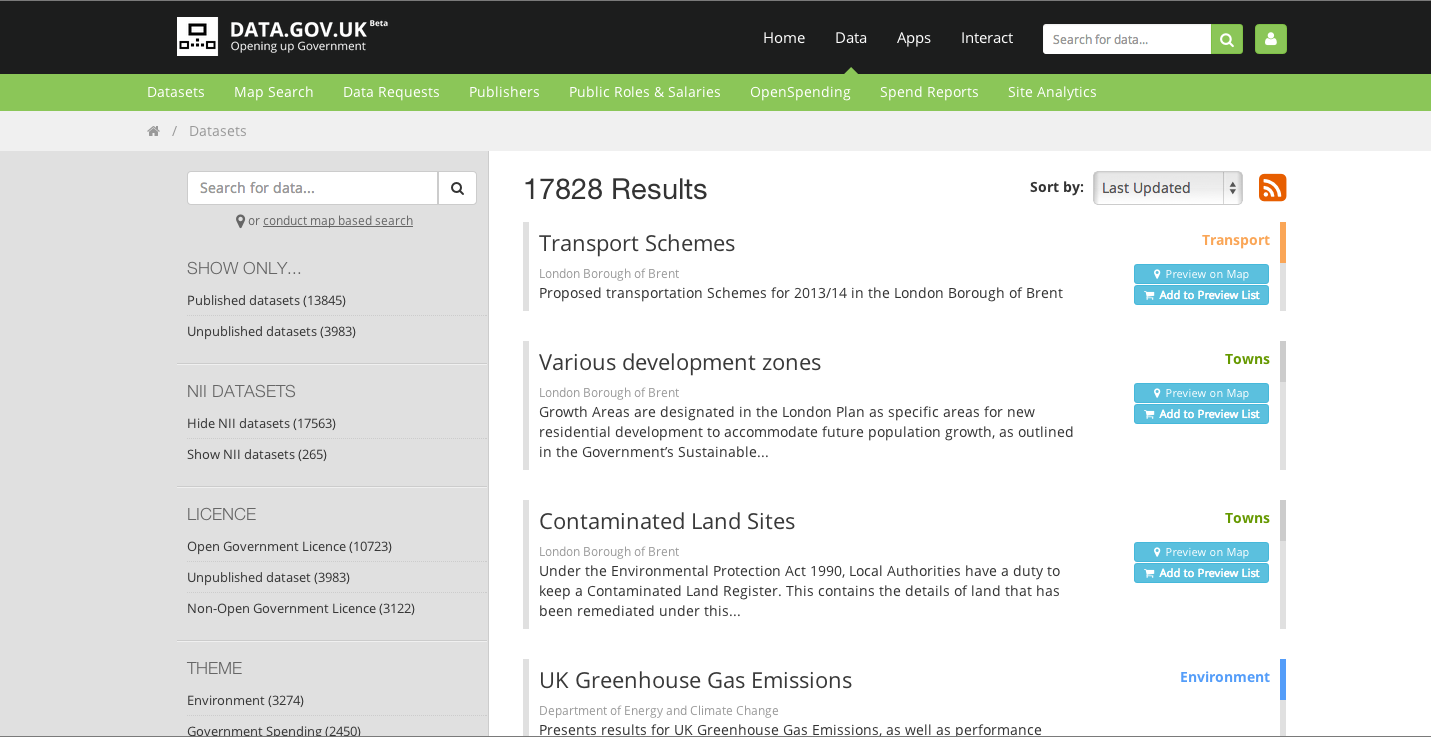
The data.gov.uk site issues public data regularly and provides it in excel .xls format. It has an easy to use interface and it is searchable by many criteria. And because it's from the UK Government, it should be fairly reliable as a data source. It looks like this:
Thursday, 6 February 2014
Making an interactive Graph
I wrote a comment piece for our science news blog, Catalyst Science News, with the headline Why we should privatise space. I will link to it when it is published, as it is still to be edited. Part of my argument was that the traditional nation state superpowers were showing a declining interest in space exploration, but I felt I needed some sort of data to illustrate this.
I found some data used by The Guardian Datablog from a few years ago. their sources seemed pretty sound (Office of Management and Budget and richardb.us) so I decided to make a few graphs to go with my article.
I used Google speadsheets to make the graphs, and I'm sure you'll agree they are less than inspiring:

Subscribe to:
Comments (Atom)