Here is a map of the United States. The darker the blue, the higher the unemployment rate. Mouse over the states to see their unemployment percentage.
Showing posts with label mapping. Show all posts
Showing posts with label mapping. Show all posts
Saturday, 26 April 2014

Moyes: Twitter reaction
Here's some more of what Twitter thinks about Moyes.
I've grabbed a few thousand tweets from ScraperWiki, a tool which makes scraping twitter easy, with a few limitations.
Here's a word cloud of the content:

Here is a map of where people are tweeting from. Click on the dots to read the tweet!
I've grabbed a few thousand tweets from ScraperWiki, a tool which makes scraping twitter easy, with a few limitations.
Here's a word cloud of the content:
Here is a map of where people are tweeting from. Click on the dots to read the tweet!
Wednesday, 16 April 2014
Owen Boswarva's comments on the #floodhack data releases by the Environment Agency
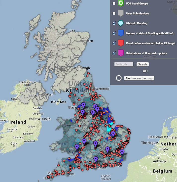
As a follow up to my story for the Guardian about open
climate data, here are Owen Boswarva's thoughts on the Environment Agency flood data releases, and his hopes for future releases. Boswarva is an open data advocate, and he sits on Defra's transparency board. He also blogs about open data for the Guardian. As only a fraction of his insights made it into the article as quotes, I have provided the full version here, as it contains a good summary of the situation as it stands, and some great links to applications that people have built using the data releases. Be sure to check out the links for some very elegant examples of what you can do with data.
How to map location of tweets using a specific hashtag
The Peer Review Watch team and I recently put on a debate on the subject of science publishing. The debate was entitled Peer review is broken. How do we fix it? and was a great success.
Not only was there a full panel of knowledgeable people from science and science publishing, there was also a full audience and participation online through our livestream and our hashtag for the event, #prwdebate.
Not only was there a full panel of knowledgeable people from science and science publishing, there was also a full audience and participation online through our livestream and our hashtag for the event, #prwdebate.
Monday, 24 February 2014
Monday, 10 February 2014
How to make an interactive map using Google fusion tables
First you'll need to get your hands on some data. To make a map, you'll want some data with at least one column of accurate location data, as well as a few columns of other information.
The data.gov.uk site issues public data regularly and provides it in excel .xls format. It has an easy to use interface and it is searchable by many criteria. And because it's from the UK Government, it should be fairly reliable as a data source. It looks like this:
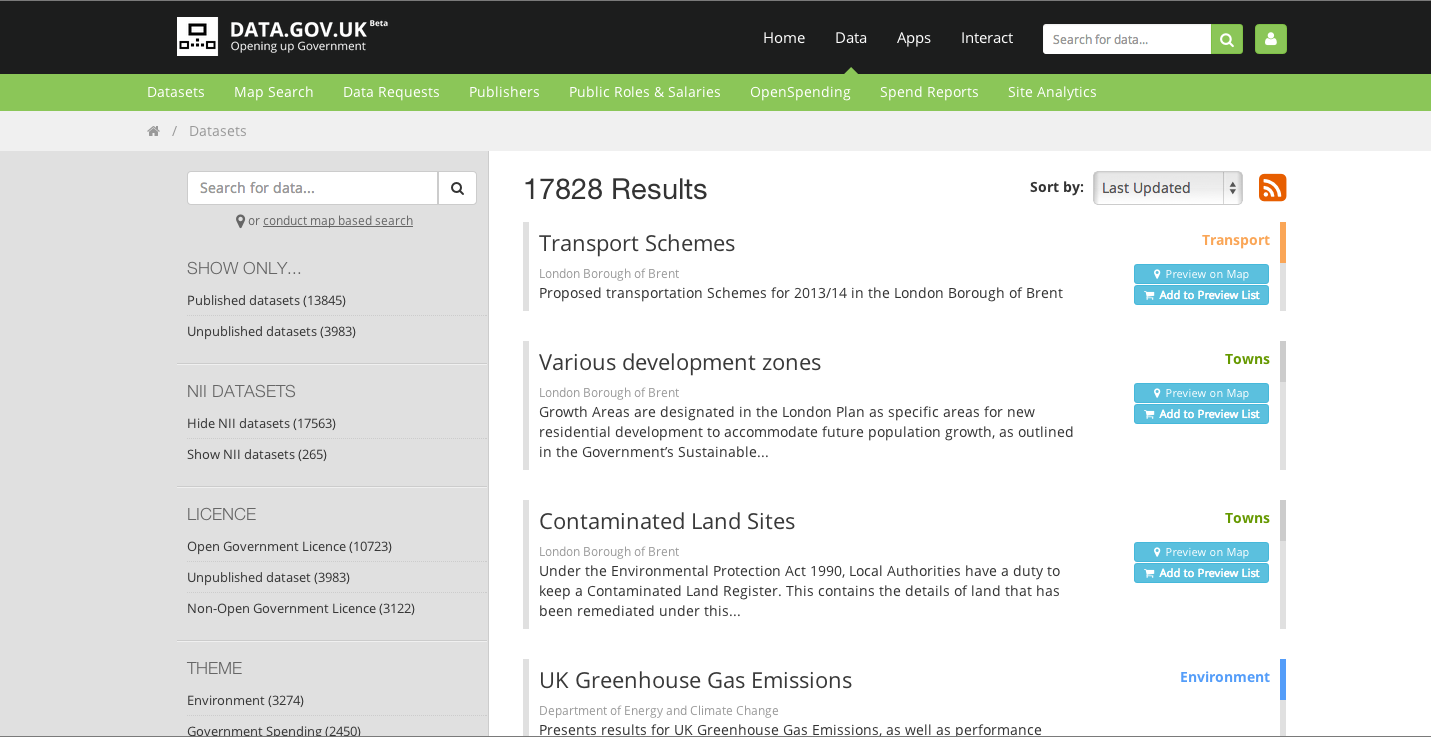
The data.gov.uk site issues public data regularly and provides it in excel .xls format. It has an easy to use interface and it is searchable by many criteria. And because it's from the UK Government, it should be fairly reliable as a data source. It looks like this:
Subscribe to:
Posts (Atom)