A new build apartment block towers over the derelict Woodberry Down Estate in Hackney. Photo by Jack Millner Figures from the Land Registry Price Index in February showed that house prices in Hackney are rising faster than any other London borough, with a 17% increase on last year's prices.
Martin Belam is editor of Ampp3d, a project by The Mirror that uses data journalism and visualisation to tell stories in a clear, concise and fun way. The site is designed to be viewed on mobile devices, and experimentation with visuals have fuelled some debate online about accuracy. Here he discusses this tension between accuracy and clarity in data driven journalism.
Here's some more of what Twitter thinks about Moyes. I've grabbed a few thousand tweets from ScraperWiki, a tool which makes scraping twitter easy, with a few limitations. Here's a word cloud of the content:
Here is a map of where people are tweeting from. Click on the dots to read the tweet!
Outwit Hub is a great tool for getting data from webpages for non programmers. Let's have a look at how to use it. First grab yourself a free version of the software by downloading it from here.
As a follow up to my post about scraping websites using Import.io where I scraped data about the most successful premier league football teams, I decided to make the data tell a better story than a simple bar chart of total league titles, which looked like this:
Import.io is a data scraping tool that is designed to make collecting data from websites easy to accomplish. So let's give it a go... First you will need to download Import.io. It's free and you can get it here.
A recent post on the Media Guido blog compares the proportion with which the BBC buys newspapers with the proportion with which the public consumes them.
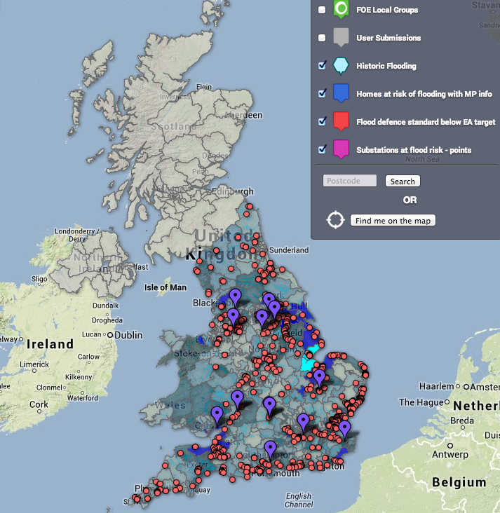
As a follow up to my story for the Guardian about open climate data, here are Owen Boswarva's thoughts on the Environment Agency flood data releases, and his hopes for future releases. Boswarva is an open data advocate, and he sits on Defra's transparency board. He also blogs about open data for the Guardian. As only a fraction of his insights made it into the article as quotes, I have provided the full version here, as it contains a good summary of the situation as it stands, and some great links to applications that people have built using the data releases. Be sure to check out the links for some very elegant examples of what you can do with data.
The Peer Review Watch team and I recently put on a debate on the subject of science publishing. The debate was entitled Peer review is broken. How do we fix it? and was a great success. Not only was there a full panel of knowledgeable people from science and science publishing, there was also a full audience and participation online through our livestream and our hashtag for the event, #prwdebate.
First you need to find a shape file. This is a file that will tell Google fusion tables what the boundaries will be on your map. These might be American states or English counties. In this example, we are going to use UK constituencies. To get hold of this you will need to go to the Office for National Statistics geoportal. Click on the 'download products' tab.
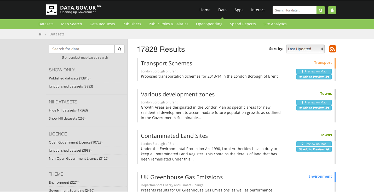
First you'll need to get your hands on some data. To make a map, you'll want some data with at least one column of accurate location data, as well as a few columns of other information. The data.gov.uk site issues public data regularly and provides it in excel .xls format. It has an easy to use interface and it is searchable by many criteria. And because it's from the UK Government, it should be fairly reliable as a data source. It looks like this:
I wrote a comment piece for our science news blog, Catalyst Science News, with the headline Why we should privatise space. I will link to it when it is published, as it is still to be edited. Part of my argument was that the traditional nation state superpowers were showing a declining interest in space exploration, but I felt I needed some sort of data to illustrate this.
I found some data used by The Guardian Datablog from a few years ago. their sources seemed pretty sound (Office of Management and Budget and richardb.us) so I decided to make a few graphs to go with my article. I used Google speadsheets to make the graphs, and I'm sure you'll agree they are less than inspiring: